WESTOWN PROPERTY MANAGEMENT
For this project, my client was looking for a new logo and brand identity for his property management company that was expanding into the Westown neighborhood of Chicago. He wanted a minimal and modern feel as well as a monochromatic color palette.
I wanted to mimic the W from Westown in the buildings of the logo and also show that the company manages both residential and retail properties.
NOLAND SPORTS TURF
Noland Sports Turf is a client that I had previously created a logo for, but I was always unhappy with the finished design. I kept tinkering with it over the years and finally came up with the design pictured here. The shield doubles as a yard line marker and the alternating green mimics the company's turf.
I sent the updated logo to my client and they loved it so much that they added it to all their new marketing materials.
KAFENIO
Kafenio is a local coffee cafe chain with a couple locations in the downtown area of Chicago. They serve Lavazza coffee, so the owners came to me to design a unique brand for them that also hinted at Lavazza's brand.
I kept the tall, bold typeface but went with a more narrow choice. Their digital menus are chalk-board style but remain clean and clear.
INFERNAL AFFAIRS
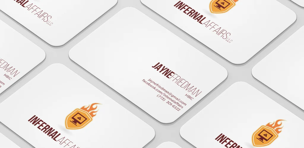
Infernal Affairs is a computer repair service owned and operated by a boisterous and fiery red-head in Chicago. I created Jayne's logo and business card in exchange for her miraculously recovering my crashed hard drive.
I wanted to keep her logo neat and simple but still play with the concept a little bit by adding the flames.
SURVIVING BOYSTOWN
Surviving Boystown is a blog that I work on when I feel like I have something to say about something. It's severely neglected and I've probably re-done the logo more often than I've actually written a blog entry.
SKINTOLOGY
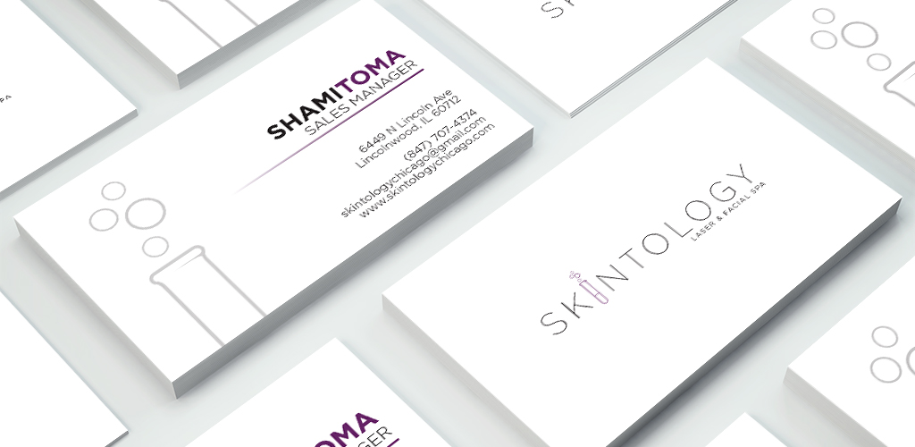
Skintology is a laser and facial spa in the Chicago suburbs. They were looking to re-brand their spa, taking it from it's salon feel to a more clinical, medical feel.
The logo and branding materials that I created are clean, modern and professional, but the pop of purple to keep it from looking too uptight.
DJ Billy Brown
Logo and branding created for a DJ with a passion for superheroes.
A. SIMON PHOTOGRAPHY
Logo and business cards created for a photographer friend.
FRANKIE'S HOUSE
Frankie's House is a custom carpentry company named after the cutest Yellow Lab that you'll ever meet. Whenever Mike is working on a new project, Frankie is there by his side with her tail knocking over just about anything in its path.
Mike wanted to go with a more traditional, classic logo, so I used a serif font for the name, paired with a script font for the tagline.
I've also included three other logo concepts here that I love but didn't make the cut.


